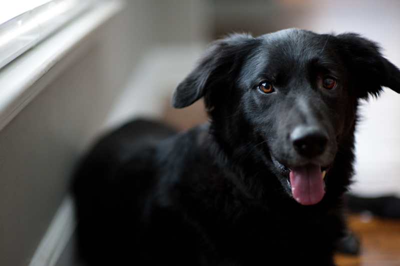
I don’t think I’ve officially introduced Max to the blog. Max is our parent’s pups and who’s been staying with us since December. Because my parents have had their hands full with chemo appointments and doctor visits and my brother has been away at school, we’ve been fostering him in our home while things settle down for them. Max will soon be going back to his real home this summer and we will miss him dearly. Even though he doesn’t always play nice with other dogs (that has proven to be our biggest challenge with him), he such a sweet and loyal dog when it comes to his humans! He and Parker have also become the best of friends… well, the best of frienemies I should really say! I wish we could keep him with us, but having two dogs permanently is more responsibility than we can handle right now with our hectic schedules, but at least he’s only a short drive away. A few pics I snapped of the pups this weekend…I love these two more than words can say!
|
|
If you’ve been around since the beginning of Mad Hearts, you’ve probably seen the very many branding and logo changes we’ve gone through. Only Madonna can rival us in the makeover department! For better or worse, I tend to work through the kinks of my business through trial and error. It’s not the best way to do things (especially when there’s expenses involved), but sometimes you just have to take the scenic route to figure out where you want to be. The first logo I created was based out of need. I was starting my business and I needed a logo for my website, watermark and business cards. So I didn’t put much thought into it. I decided on a typewriter font in black with a hot pink heart. Not really sure what I was thinking! It looked very teeny bopper and nothing like me at all. Over the years, the look continued to evolve. We did scripted fonts and type fonts. Our colors changed from hot pink to aqua to aqua/yellow/gray. I hired professional designers and tackled a few of the designs myself. Everything changed at one point or another, except the name! All the while, I kept spending money on new business cards, branding/marketing materials and supplies with each evolution and yet, never feeling quite satisfied with the final product. I was one step closer to where I wanted to be, but couldn’t figure out what was amiss.
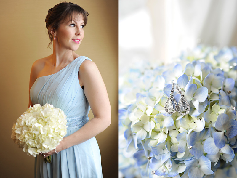
In the last year, I realized I was looking outward for inspiration when I should have been looking inward. For starters, I was using what I was currently shooting (family and children) to inspire my logo and branding. The problem is that I really wanted to focus on weddings, couples and glamour, but nothing about my branding indicated that was the clientele I was after. Everything from my colors to my font choices to my packaging screamed “child photographer”. It’s no wonder I wasn’t getting the kind of assignments I really wanted. And let’s not forget: as an independent photographer, I’m selling myself – as well as my work. The colorful branding was not something that I could relate to at all. I wear black about 90% of the time. My house is painted different shades of gray. I adore reclaimed wood, industrial elements, clean lines and neutral pieces. I didn’t love it because it wasn’t ME! Plain and simple. It doesn’t take a genius to figure that out, but it took me four years and a dozen “makeovers” to finally come to the obvious conclusion. The new Mad Hearts branding is clean, modern and simple and reflective of the woman behind the brand. My guess is that this one will be sticking around a little longer than the others because it resonates with me on a personal level and more importantly, it reflects the directions in which I want my business to go. If you ever find yourself in a similar rut, take a personal inventory. Perhaps ask your closest friends/family members how they would describe you and your style and make a list. If there’s a general theme in the responses, then you’re off to a good starting point. It’s so much easier to sell your brand when you ARE your brand! More “Advice” posts can be found here.
April 29, 2014 - 4:35 pm
Great post Maddy! I think this is one of the hardest parts of owning your own business. We put so much time and energy into our small businesses but at the same time we can’t think clearly. It’s so hard since we are only people in our business. I know I get sucked down the rabbit hole a lot online looking for ideas and what is happening. I know if I walk away and think on my own, the ideas will start to come out of my head instead of someone else’s.
April 30, 2014 - 10:59 am
So true! I have a love/hate relationship with Pinterest for that same reason. It’s true – so many great ideas that you can stare at for hours! But I sometimes a good brainstorming session with a pen and pad yields better results :)
October 18, 2015 - 1:43 pm
Hi Maddy! I just found you and your beautiful pictures via Communal Global (I’m one one the corrent contributor and i was looking to the “old friends” page when i found you!) i love this advice section (as well as all the blog).. i would love to become a photographer as well (kids are my passion) and i just tried to think about the logo of my blog and how can be more ME. asking to friends and family can definetely be the solution! Thanks! Tax season is finally over and I thought it would be fun to do a quick rundown of my best business expenses of last year. After tracking my expeditures using an accounting software, I learned a lot about my spending habits. I find that the purchases where I have done my research and weighed their pros/cons tend to be the most beneficial to me in the long run. I’m getting more mindful of this and can already see the improvement in my business expenses so far this year. I want to be very clear that when I say “best”, I do mean the best for me and my business. I recommend you do your own research if you’re looking into any of these products seriously and draw your own conclusions.
○ Nikon 35MM F/1.4: I wrote a review on this lens almost a year ago and I still think it was one of the best lens purchases I’ve made to date. It’s been a lifesaver several times in low light wedding situations and it’s my favorite lens to take on vacation. I’m glad that I saved up for this one! ○ Stellar Phoenix Recovery: We don’t always have control when it comes to technical difficulties and that “Card Error” message is like a punch in the gut, especially when it involves client photos. This was a unexpected purchase for me last year, but my last chance at recovering an entire session worth of photos. Needless to say – it worked! Stellar has some mixed reviews on the web, but luckily, it worked for me. I hope you’ll never find yourself in the same precarious siatuation! ○ Photojunction: Discovering Photojuction – a free desktop album designer – was probably the biggest win for my business! Before then, I absolutely HATED designing albums in Photoshop. It was so tedious and time consuming. Photojunction made album designing fun and effortless. Even though you can create your own templates, I decided to invest in pre-made album templates from Templates for Photographers. With dozens of beautiful and classic album spread options, all I have to do is pick the one I want, drag and drop my images already uploaded into Photojunction onto the T4P premade templates and I can create beautiful spreads in minutes…or even seconds! This gave me my life back and freed up hours that I would have spent in front of the computer. ○ Red Leaf Boutique Basic Lighting & Photography Guide: I find that investing in education is an absolute must to stay competitive in this business. I found myself trying to avoid shooting in certain light conditions because they weren’t the easiest to work in. However, that’s not always possible and it can be limiting. After reading this guide, I gained the confidence to shoot in any type of lighting condition and still yield great results. They wrote it in a very simple and structured manner that made it easy to follow and understand. If you’re struggling with getting “things right” in camera, I highly recommend this guide. Lots of great advice for shooting in all types of natural light environments. I’d love to hear what made your “Best List”. It doesn’t have to be photography related, just something you love and can’t live without.
April 28, 2014 - 7:48 am
Thanks for all the great tips, Maddy!
April 29, 2014 - 4:46 pm
I do this type of list about once a year for my business. For me it’s about finding my materials (paper, adhesive, bubble envelopes) at good prices. I also try and invest in a class or online class/book each year or every 6 months. I find it so helpful to read about other small business owners or how they solve their small business problems. I really enjoyed reading “The $100 dollar startup” by Chris Guillebeau. Learning a new skill or a different approach to something is always good for the brain!
April 30, 2014 - 11:02 am
My best investments have been educational in the last few months. I’ll have to check out that book! Thanks for the suggestion! |



Camila Faria - How adorable! I love this last picture of Max and Parker. They’re both so good looking!
Tiffany B. - They both look great! Do they actually stay still for you? Or is someone behind you holding a treat while you take these photos? ;) My dog will stay still for a while it just depends on his mood. I hope your family is doing better!
JWS3 - great pictures even tho i dont like animals.
what happened to our ONCE A MONTH?!
I MISS YOU
Maddy {Mad Hearts Photography} - I know! We are due. Maybe this Friday? I’ll text you.
Amy - Those faces! Too, too much . . .
Elly - Too cute! :)